|
CREATE AN
EFFECTIVE
POSTER
Will
G. Hopkins
©1997
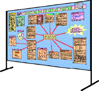
This document was created
originally as a multi-panel poster. The text under each
heading and the figures were on separate panels, as
illustrated at right.
|
|
This article represents text and graphics updated from a poster I
presented at the 1995 annual meeting of the American College of
Sports Medicine. You can download a zip-compressed version in rich
text format. You can also download a zip-compressed file containing
two templates for creating poster panels with PowerPoint 4: one each
for landscape and portrait orientations of the panels.
Last updated 26 Feb 1997
ABSTRACT
Background.
Posters are a more relaxed and efficient medium than slides.
Elements of an effective poster include:
- Concise
content. Make it
similar to a brief communication. Combine Results and Discussion.
An itemized Conclusion is helpful. Cite few, if any,
references.
- Plain
language. Make
sentences short. Avoid jargon and abbreviations. Be informal: use
I, we, you, not the passive voice.
- Clear
graphics. Clarify
the study design with a diagram. Use a graphic suitable for your
data. Split a complex graphic into simpler ones. Give informative
titles. Label axes horizontally and show units. Label multiple
lines, bars, and pie-chart segments directly, rather than via a
legend. Use LARGE plotting symbols. Show error bars. Avoid the
"depth" effect.
- Few
tables. Use tables
for descriptive statistics of your subjects and for sets of
correlation coefficients. Otherwise, graphics are usually
better.
- Relevant
numbers. Use two
significant digits for correlations, percentages, relative risks,
effect sizes; one or two for standard deviations; and one for P
values. Omit test statistics (t, F, c2
). Show errors as SDs, never as SEMs.
- Big plain
fonts. Main text
25-30 pt; detail 20-25 pt; headings 40-200 pt. Use italic
or bold for emphasis. Avoid fancy fonts and
underscore.
- Lots of
color. If text is
black on white, use colored pens, prints, or card to enhance
graphics, titles, or panel mounts. Color printing is superior, but
use dark text against pale backgrounds
- Visual
impact. Be
creative with shape, decoration, and placement of the panels. Add
icons or prints to focus attention.
- Efficient
mounting. Use
PowerPoint or similar drawing program to make one or more panels.
Laminated paper and Velcro dots are better than card and pins.
Group related panels, or link with colored tape on the board.
BACKGROUND
Got some good results? Make them even better by presenting them
well. If you're giving a poster, cool! Posters can be better than
slides. The atmosphere is more relaxed. The author can talk
one-to-one with interested people. And as a viewer you can skip
posters on uninteresting topics, but you have to sit through a boring
talk.
Here's my advice on how to make your poster effective. Most of it
is obvious, but some is new and may surprise you.
All data shown in this poster are
fictitious.
CONCISE CONTENT
- Make your poster similar to a brief communication, with
Abstract, Introduction, Methods and so on.
- It depends on the topic, though. For example, this poster
needed a different approach.
- Explain why you did the work in the first sentence or two of
the Introduction. And make it seem interesting, even if it's
not!
- Don't put too much information in your poster. Some details
can be left for face-to-face discussion.
- A hint of humor doesn't hurt.
- Try combining Results and Discussion sections.
- I have found that a combined Results and Discussion section
is easier to write and read. It's a pity more journals don't
allow this approach.
- An itemized Conclusion is helpful.
- Cite few, if any, references.
 PLAIN
LANGUAGE
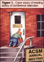
- Make sentences short: some people can't read even simple
instructions (see Figure 1).
- Avoid jargon and abbreviations.
- You should aim for a wide audience, so avoid technical terms
known only to experts. Obscure abbreviations also interrupt the
flow.
- Be colloquial rather than formal: use I, we, you, not
the passive voice.
- But you still have to get spelling and grammar right. Check
out the guidelines
on style at this site.
CLEAR GRAPHICS
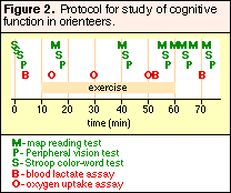
- Clarify the design of a complex study with a diagram (e.g.
Figure 2).
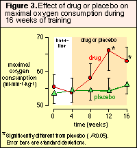
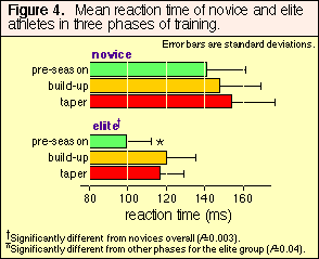
- Use the most appropriate kind of graphic for the data: a line
diagram or scattergram when both variables are numeric; a bar
graph when only one is numeric; a pie chart for proportions in
different groups (Figures 3-5).
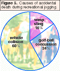
- A bar graph is often better than a pie chart for
proportions.
- Two simple graphics may be better than a complex one.
- Give each graphic an informative title.
- Label the axes with horizontal lettering, and always show
units (cm, s, %, etc.).Why horizontal lettering, even for the Y
axis?

- Label multiple lines, bars, and pie-chart segments directly
rather than via a legend.
- Make sure different plot symbols are LARGE enough to be
distinguished.

- Error bars are essential, but don't clutter the figure with
too many.
- Avoid the "depth" effect.
- Depth is the 3-D effect that graphing packages can give to
2-D data. Good journals don't use it, because it's
distracting.
 FEW
TABLES
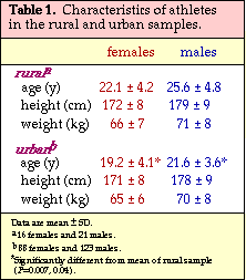
- Use a table for descriptive statistics of your subjects and
for sets of correlation coefficients. Otherwise, graphics are
usually better.
- Some simple results can be stated in the text rather than in a
table or graphic.
- Follow the style shown in Table 1. Partition with horizontal
lines, but avoid vertical lines.
RELEVANT NUMBERS
- Use two decimal places for correlations. Use two significant
digits for percentages, relative risks, and effect sizes; one or
two for standard deviations; and one for P values.
- These rules apply to full publications, too.
- Too many significant digits clutter the data and show you
up as statistically naive.
- Here are some correct examples:

- Omit test statistics (t, F, c2).
- This rule also applies to full publications. If you have
included a P value or a confidence interval, the test statistic
is redundant.
- Show "error" as a standard deviation (SD), never as a standard
error of the mean (SEM).
- SDs show the spread of numbers.
- SDs convey the size of the difference between means of
groups.
- SEMs are absolutely wrong for repeated measures.
- People use SEMs because they are smaller and look
better!
BIG PLAIN FONTS
- Most text should be in 25-30 pt. Detail should be in 20-25 pt.
- Big fonts are easy to read.
- With big fonts you'll have to be brief, because you won't
have room to write too much.
- Headings should be in 40-200 pt.
- The main title of this poster was in 170 pt Chicago; the
headings of each panel were in 48 pt Helvetica/Arial.
- Fonts like these, without serifs, seem to look better for
headings.
- Use italic or bold for emphasis.
- Avoid fancy fonts and underscore.
- Fancy fonts are OK for a relevant effect in a
heading or graphic, but otherwise they are hard to read.
- Underscore belongs in the era of typewriters or the
Web!
LOTS OF COLOR
- If text is black on white, use colored pens, prints, or card
to enhance graphics, titles and panel mounts.
- For best results, scan colored prints into a computer and edit
them with a graphics package.
- Color printing is superior to black and white, but use
dark-colored text against pale backgrounds.
- Ink-jet printers are as good as laser printers for posters.
Use printers with two cartridges (black plus color) to get the
best dark colors and black.
VISUAL IMPACT
- Be creative with shape, size, decoration, and placement
of the panels.
- Add icons or images to focus attention. But make sure they are
relevant.
EFFICIENT MOUNTING
- Create with Microsoft PowerPoint or a drawing program.
- Download and try the accompanying PowerPoint
templates.
- Use one PowerPoint 4 document for all panels in landscape
orientation, and another document for portrait
orientation.
- The maximum size of panels in PowerPoint is 54" x 54". For
larger panels use CorelDraw, ClarisDraw, Adobe PageMaker, or
similar.
- Print as one or two large panels or as 5-20 smaller panels.
- Smaller panels (1-2x letter or A4 size) are easier to make,
update/correct, and transport.
- Larger panels with integrated artwork can look more
professional.
- Card+pins is the traditional method for mounting, but
laminated paper panels with Velcro dots are easier to make,
transport, and mount. Use matt or semi-gloss lamination, not
glossy.
- Overlap or tape panels together at the venue as necessary. Get
there early if you have a lot to do.
- Group related panels together, or link them with colored duct
tape stuck onto the display board.
CONCLUSIONS
- Main features of an effective poster:
- plain language and concise content;
- clear graphics and tables;
- not too many numbers;
- big fonts;
- lots of color.
- Creating an effective poster takes time, but it's fun.
- Like everything else, give it your best shot.
resources=AT=sportsci.org
·
webmaster=AT=sportsci.org
·
Homepage
·
Copyright
©1997
Last updated 26 Feb 97

 PLAIN
LANGUAGE


 FEW
TABLES